I found out about Essie Shine of Times on Friday and went and got it over the weekend. I had actually seen the Luxeffects display in person and missed it! After returning specifically for this polish, I can understand why. The polish looks quite demure in the bottle compared to its flashy companions in the collection and was just plain boring on the nail wheel. Yup, I said it, boring. I could barely see that there was polish on the white sample wheel. As you’ll observe in the following photos, Shine of the Times can be hard to spot on lighter colors and does best over dark colors.
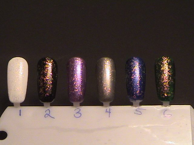 |
Essie Shine of the Times over various colors(indoors) Essie Shine of the Times over colors 1-6 (outdoors) |
 |
| Essie Shine of the Time over colors 7-12 |
 |
| Bottle shots, colors 1-6 |
 |
| Bottle shots, colors 6-12 |
I tried my hardest, but was not able to get a good shot of SotT over white. Here's my best attempt:

1) Wet n Wild- White Creme |
2) Wet n Wild- Black Creme |
3) OPI-Grape, Set, Match (purple) |
4) Revlon-Steel-her Heart (grey) |
5) Finger Paints-Artist’s Sapphire (royal blue) |
6) Sinful Colors-Last Chance (forest green) 7) Island Girl-Aloha Paradise (teal green) 8) Revlon-Strawberry Electric (bright pink) 9) L’Oreal-Lickety Split (metallic darkish green?!) 10) Sinful Colors-Nirvana (brown) 11) Finger Paints-Amethyst Atelier (dark purple) 12) Elf-Dark Red |
I think the pictures speak for themselves. SotT is most dramatic against dark colors. My personal favorites were dark purple, dark blue and dark red. I hope my post helps you decide how to layer Essie Shine of the Times!
No comments:
Post a Comment